Why shouldn’t I use “position: absolute”?
A large part of the complexity of web design lies in the way in which the positioning of elements is handled, particularly in comparison with print design. With the right methods, however, it is possible to take advantage of features that make the design fluid and precise.
Chapter 1
A matter of relativity
The main difference between print and web lies in the infinite number of formats that a website design is supposed to cover, whereas a printed object will only have one format, often defined upstream and linked to the constraints of the medium or printing.
Print design
This defined nature of design for print makes it possible to adopt an extremely free and handmade approach. Even though design is generally based on very precise grids and methodologies, it is always possible to create exceptions and refine certain decisions by hand (think of typesetting, for example).
Web design
Web design, on the other hand, does not allow for exceptions, and above all it is bound to receive content that will be remodelled years after the website has been put online by content managers who will not have the option of updating the code.
The web designer’s approach is therefore one that cannot, by its very nature, be based on a particular screen size and content, but rather on an infinite number of screen sizes and constantly changing content.
A design relative
to content
In fact, it’s a question of thinking about a design that adjusts, that adapts, that is relative. The positioning and size of each element on a website will therefore have to adjust to the size of the screen, to its own content and also to the content and positioning of the other elements on the page.
It is therefore impossible, for the majority of elements on a website, to reason in terms of absolute values, values that cannot be adjusted according to the unique characteristics of each user’s visit and each piece of content.
Chapter 2
CSS positioning
As CSS is the language used to style a web page, it is the one that allows to modify the way in which an HTML element is positioned on a page, firstly by means of the position property.
There are 5 possible values for the position property, which can be used to define the behaviour of an HTML element in what is known as the flow of the document, i.e. the way in which the elements are positioned and react in relation to each other.
position: static
The static position is the default value for all HTML elements, and does not modify the way in which the element affects the document flow.
.element {
  position: static;
}
position: relative
The relative position, in the same way as the static position, does not modify the way in which the element affects the flow of the document, but unlike the static position, it creates a new context, in other words, it means that the element is not simply positioned by default.
.element {
  position: relative;
}
position: absolute
The absolute position, on the other hand, removes the HTML element from the document flow, in other words, neither its size nor its positioning interferes with the other HTML elements. Its position is defined relative to the nearest positioned parent (if there is one) or to the document.
.element {
  position: absolute;
}
position: fixed
The fixed position, in the same way as the absolute position, removes the HTML element from the document flow, but unlike the absolute position, its positioning is relative to the screen.
.element {
  position: fixed;
}
position: sticky
The sticky position acts in the same way as the relative position and therefore does not modify the way in which the element affects the document flow. But unlike the relative position, the element will be fixed at a defined position on the screen, within the nearest positioned parent (if there is one) or within the document.
.element {
  position: sticky;
}

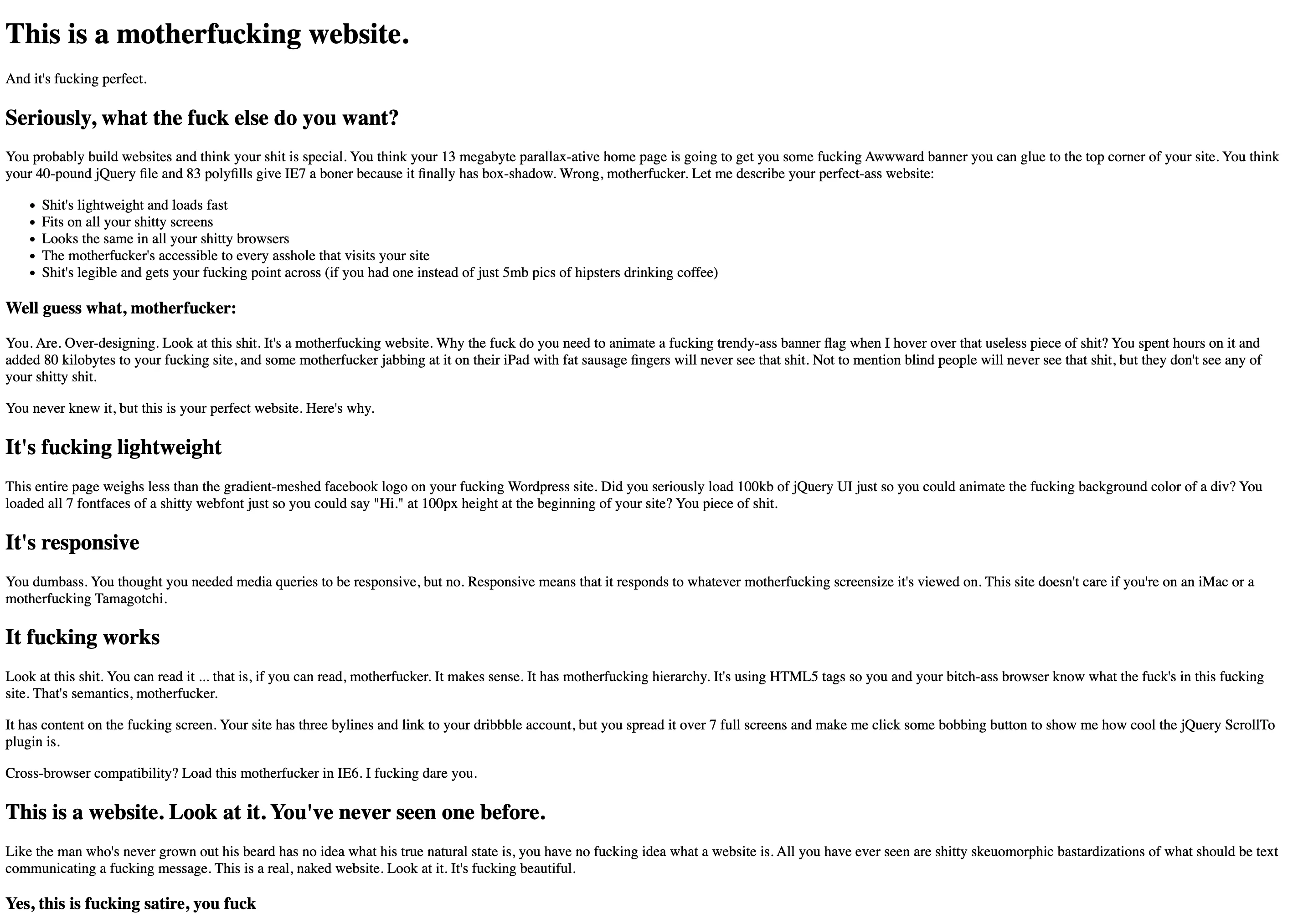
In general, and except in specific cases, it is necessary to act as little as possible on the document flow to allow the elements to behave naturally according to the other elements and the size of the screen. In a rather sarcastic way, the Motherfucking Website reminds us that HTML is natively responsive and that it is precisely by modifying the default behaviour that we prevent reading on all screens and with all types of content.
motherfuckingwebsite.com
Chapter 3
The layout of a website
That said, not all websites are intended to resemble an HTML website by default, and it is the job of the designer and developer to modify this default design by changing the initial behaviour of the elements, and CSS allows us to do this without undermining the relativity between the elements, quite the contrary.
Block vs Inline
By default, HTML elements are arranged in the document flow in two different ways: either as a block or inline. This value is defined by the CSS display property.
display: block
The block display value positions the elements vertically in relation to each other, starting at the top left. This is the default behaviour of most HTML elements, particularly <div>.
.element {
  display: block;
}
display: inline
The inline display value positions elements in relation to each other, horizontally, starting at the top left. By default, when the parent element is filled to its full width, the next child element is repositioned to the left, below the first line. This layout transposes the layout of writing into code, and is therefore the default behaviour of text elements (unicode characters) or <span>.
.element {
  display: inline;
}
Grid vs Flex
However, these two types of default layout are fairly restrictive in many cases, and the CSS language now offers many other possibilities, some of which are particularly well suited to complex page layouts: the flex display and the grid display.
These two types of layout are defined at the level of the parent element and then influence the positioning of the child elements according to other values defined by the developer. There are a large number of these values, and they can have a very fine-grained influence on the positioning of elements, even though they can sometimes be complex to use at first.
display: grid
The grid display is used in all contexts where elements need to be positioned on a grid, with a certain number of columns and/or rows of defined sizes. Schematically, grid positioning is two-dimensional.
Complete guide on css-tricks.com.
.element {
  display: grid;
}
display: grid
The grid display can be used to reproduce page layout grids such as those used in InDesign, by defining a number of columns and/or rows, gutters, alignments, etc. in an extremely accurate way. The main CSS properties associated with it are grid-template-columns, grid-template-rows, grid-column-gap, grid-row-gap, justify-items and align-items.
.grid {
  display: grid;
  grid-template-columns: 1fr 1fr 1fr;
  grid-template-rows: 100px 100px;
  grid-column-gap: 20px;
  grid-row-gap: 10px;
}
display: grid
To make full use of the grid layout, certain values can also be defined at child element level, in particular grid-column and grid-row.
.grid {
  display: grid;
  grid-template-columns: 1fr 1fr 1fr;
  grid-template-rows: 100px 100px;
  grid-column-gap: 20px;
  grid-row-gap: 10px;
}

.grid__item {
  grid-column: span 2;
  grid-row: 2 / 3;
}
display: flex
The flex display is used in all other contexts, in other words in all contexts where the size of the elements is more flexible than in a grid. Schematically, flex positioning is one-dimensional.
Complete guide on css-tricks.com.
.element {
  display: flex;
}
display: flex
More than just a layout for creating complex page layouts, the flex display is above all useful for defining vertical or horizontal alignments. The main CSS properties associated with it are flex-direction, flex-wrap, justify-content, align-items and gap.
.element {
  display: flex;
  flex-direction: row;
  flex-wrap: wrap;
  justify-content: space-between;
  align-items: flex-end;
  gap: 20px;
}
